04 / 11
Halcyon
Halcyon is a slow fashion label built on the conviction that clothing should age well. Entering their second year, they had a product they believed in but a visual language that hadn't kept pace with their growing ambitions — stockist conversations with premium retailers were stalling at the visual presentation stage.
They needed imagery that could work in a Portsea boutique and a London press pack simultaneously. A world, not just photographs.
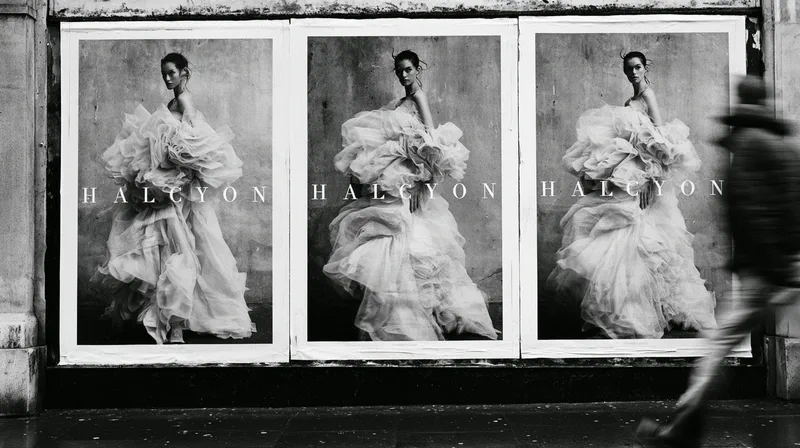
Street posters, autumn — the photograph and the name, nothing else
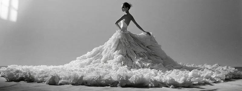
V.'s starting point was a contradiction: a label built on restraint needed one image nobody could walk past. The answer was a single sculptural gown, made in Halcyon's own workroom from a season of offcuts — raw-edged linen, crushed cotton, unbleached wool — and photographed like couture. Everything the label believes about fabric, in one frame.
Riley stripped the rest away: no location, no colour, a bare studio wall and one window's worth of light. Hector shot the campaign in black and white over two days, in light that didn't flatter but revealed — every crease and raw edge left in.
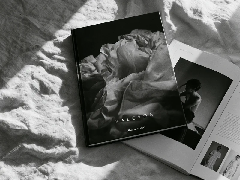
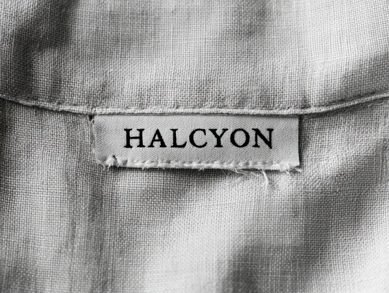
Marvin gave the pictures somewhere to live: a widely spaced serif wordmark, a lookbook for stockists, woven labels, and street posters carrying nothing but the photograph and the name. Priscilla timed the release to the buying season — the lookbook to stockists first, the posters a week later.
The campaign shipped to existing and prospective stockists ahead of the autumn buying season. Halcyon secured listings with two new premium retailers within sixty days of the campaign launch.
Direct-to-consumer conversion improved significantly over the following quarter. The campaign imagery has been licensed for editorial use in two independent print publications.
Selected work