05 / 11
Studio North
Studio North had operated for a decade under the name of its founding director. A leadership transition and the addition of three new disciplines — motion, environmental, and strategy — prompted a full rebrand: new name, new identity, new positioning.
The studio needed to carry forward the credibility of ten years of work while signalling a deliberate change in direction. The rebrand had to be legible to long-standing clients and compelling to the new client types they were pursuing.
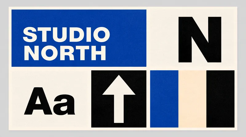
Identity system — wordmark, monogram, north arrow, type, and colour
The strategy phase established a positioning centred on outcomes rather than craft — Studio North makes things that work, beautifully. That single distinction clarified every downstream decision: the name, the mark, the website hierarchy, the case study structure.
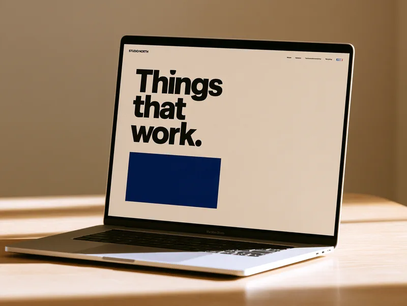
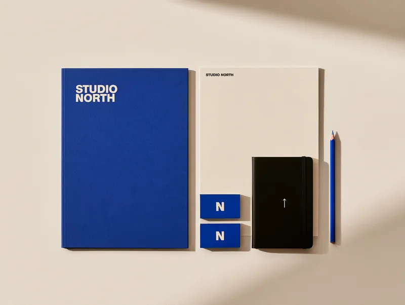
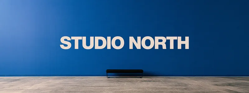
The identity is built on restraint. A type-led wordmark with no unnecessary embellishment, a single-letter monogram, and one graphic device: an arrow pointing north. One colour does the work of a palette — a cobalt that reads as clinical on a healthcare brief and confident on a cultural poster, held against black and warm off-white. The website opens on three words, "Things that work.", and lets the projects earn the methodology section.
Studio North launched the rebrand to their existing client network in Q4 2024. Three inbound enquiries from new clients arrived within the first month — including one brief that became a twelve-month retainer engagement across brand and digital.
The founding director called it the first time in a decade the brand felt like it was leading the conversation rather than following it.
Selected work