03 / 11
Vela
Vela is an independent production company founded by a director and a producer who wanted an identity that could credibly represent them across festival submissions, brand partnerships, and original content pitches — without looking like a generic production logo or a personal portfolio.
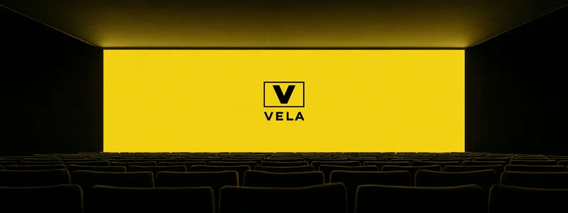
The mark needed to work at thumbnail scale and on a cinema screen. The motion system needed to feel like part of the work, not separate from it.
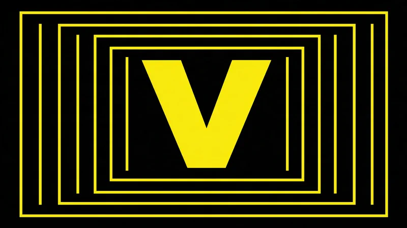
The motion system — the reveal, every frame at once
V.'s direction to the team fit on one line: the brand should take up as little room as possible, and be unmistakable in the room it takes. Josie derived the mark from a V traced through the geometry of a film frame — reduced to its simplest form, it reads equally as a symbol and a letterform. No gradients, no depth effects. One colour, a lemon yellow borrowed from film leader and gaffer tape, against black.
Derik's motion system activates the mark through a single reveal behaviour — one line opening into the frame — consistent across every touchpoint from title idents to pitch decks. The decision not to animate beyond one signature behaviour was deliberate: restraint in the brand language creates space for the work itself to move.
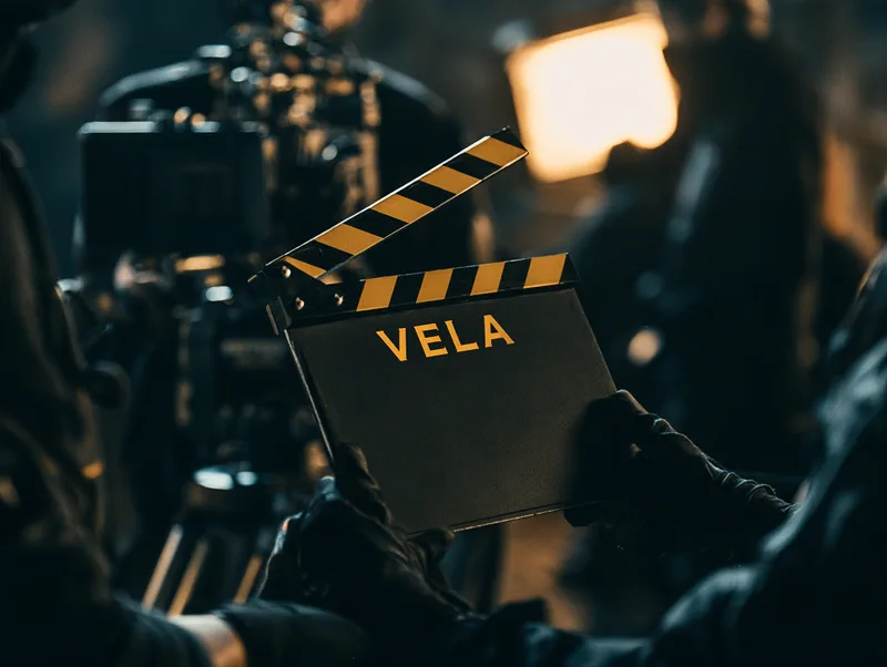
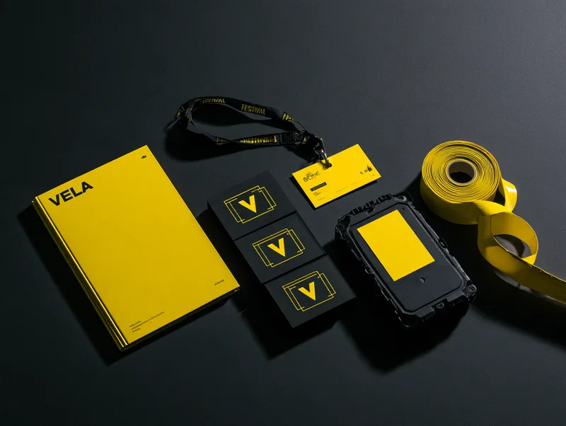
Mike directed the launch ident and carried the system onto set, from slates to crew kit, so the identity was already in use on Vela's debut short before it was ever announced.
Vela launched the identity alongside their debut short film, which subsequently screened at four international festivals including one BAFTA-qualifying programme.
The brand system has since been applied to three commercial productions and a branded content campaign for a fashion client, with no modification to the core mark or motion system.
Selected work